Better tabletop maps with Obsidian Canvas
Like all the D&D nerds who love productivity tools, I’m always on the lookout for a way to overengineer my game.
So when Obsidian added its Canvas feature, I thought two things at once: first, “This would be a great place to keep my maps!” and then, “Boy it gets busy though.”
Let’s talk about the first before I show you what I’ve done about the second.
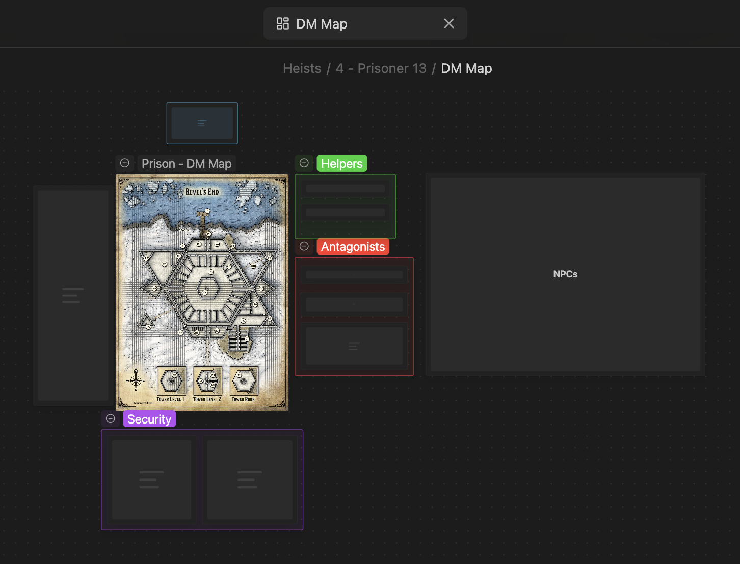
I’ll be using some examples from the Prisoner 13 adventure in the Keys from the Golden Vault module. They’re not massive spoilers, but consider this your minor spoiler warning if you plan to play it soon!
You can add images like maps to a canvas directly, but I find that it’s a bit easy to accidentally move a map and mess everything up.
Instead, I add a group and then set the map to be its background image. Groups don’t move if you drag inside them — only if you drag their headers — and if you do move them, all of the nodes inside them move too.
Here’s one map I recently ran, zoomed out:
When you zoom in, you can see the sorts of things I furnish the map with: area descriptions, names and traits of protagonists and antagonists, and other notes:

As soon as I started doing this, I wanted to start pinning locations on the map. Rather than listing antagonists off to the side, I wanted to position them on the map. Instead of keeping lists of loot in a separate section, I wanted an icon of a treasure chest where the party might encounter it.
You can absolutely do this with Canvas out-of-the-box, but things get cluttered quickly. Cards take up a good bit of room, and although you can make the map group much larger to compensate, I tend to find it’s not quite the experience I’m looking for.
What I really wanted was icons that I could position on the map. The content would be hidden until I clicked or hovered over them.
I toyed around with developing an Obsidian plugin to make this work, but it turns out there’s a plugin that can already get us most of the way there: Advanced Canvas.
Advanced Canvas comes with a bunch of features, but the really useful one for maps is custom node styles. It essentially lets you apply metadata to your nodes and then style them with CSS.
We’re going to use this to create some cards that revert to icons until they’re focused:
The first part lies in setting up the menu entry. You’ll need to dig into your vault’s hidden Obsidian folder to do this: the file is .obsidian/plugins/advanced-canvas/data.json. If you open the file up, look for the following line:
"customNodeStyleAttributes": []I replaced it with this (if the line doesn’t appear, just insert this):
"customNodeStyleAttributes": [
    {
      "datasetKey": "mapStyle",
      "label": "Map style",
      "options": [
        {
          "icon": "x",
          "label": "None",
          "value": null
        },
        {
          "icon": "badge-dollar-sign",
          "label": "Treasure",
          "value": "treasure"
        }
      ]
    }
]
This block essentially says, “Create a menu with the name ‘Map style’ and the options ‘None’ (the default) and ‘Treasure’ (with a badge-dollar-sign Lucide icon). You can have as many options as you want, but you need a default (with value null).
Then we write a CSS snippet to target nodes that have these options selected. Nodes using these options get a data-[datasetKey] attribute: for example nodes using the treasure option on the mapStyle menu above receive data-map-style="treasure".
So here’re the bones of a snippet that give us icons on our cards, and those cards are visually hidden unless they have focus.
First we hide the cards. We don’t want to hide all the cards, just the ones that have the treasure option:
.canvas-node[data-map-style="treasure"] .canvas-node-container {
  opacity: 0;
  pointer-events: none;
  transition: opacity 0.2s linear;
}
You could also target .canvas-node[data-map-style] if you want to hide cards with any map style option other than the default.
If you’ve used CSS before, you might be tempted to use display: none here to stop the card from being clicked when it’s invisible.
Unfortunately, this doesn’t work — it looks like the canvas intercepts kicks and compares the coordinates to the bounding boxes of all the nodes, then manually updates the card in question. I think it would be difficult to stop mouse interaction altogether without writing a plugin.
Adding pointer-events: none doesn’t stop the invisible cards from being clicked to focus, but it does stop you from clicking and dragging a card that you can’t see — it needs to be clicked once to focus it and then it can be dragged. (Unfortunately, it can be resized while invisible!)
Of course, once the card is focused, you want it to appear again:
.canvas-node[data-map-style="treasure"].is-focused .canvas-node-container {
  opacity: 1;
  pointer-events: all;
}
Now we just need an icon.
Here’re some styles I’ve settled on for a basic icon (though it could use some polish). I’ve broken it up into the boilerplate display properties, positioning, sizing and appearance:
.canvas-node[data-map-style="treasure"]::before {

  /* use this to make the icon appear at all */
  opacity: 1;
  pointer-events: all;
  z-index: 1;
  display: block;

  /* use this to resize the icon bubble (but not the icon itself) */
  --canvas-icon-size: 1em;

  /* positioning */
  position: absolute;
  top: calc(var(--canvas-icon-size) * -1);
  left: calc(var(--canvas-icon-size) * -1);

  /* sizing */
  width: calc(var(--canvas-icon-size) * 2.2);
  height: calc(var(--canvas-icon-size) * 2);
  padding-top: calc(var(--canvas-icon-size) * 0.2);
  align-content: center;
  text-align: center;

  /* appearance */
  border-radius: calc(var(--canvas-icon-size) * 1.1);
  background-color: gold;
}
For the most part, you shouldn’t need to touch the sizing properties; just change --canvas-icon-size. In fact, if you want to size all icon types individually, set this on the whole canvas:
.canvas {
  --canvas-icon-size: 1em;
}
The last part of the icon is the actual icon. Although Obsidian has access to Lucide.dev icons internally, I don’t think you can access them straight from CSS. Instead, you can copy the content of an icon and embed it directly. Use the content property and paste the code provided by the ‘Copy Data URL’ button in, wrapped in url(""):
.canvas-node[data-map-style="treasure"]::before {
  content: url("data:image/svg+xml;base64,PHN2ZyB4bWxucz0iaHR0cDovL3d3dy53My5vcmcvMjAwMC9zdmciIHdpZHRoPSIyNCIgaGVpZ2h0PSIyNCIgdmlld0JveD0iMCAwIDI0IDI0IiBmaWxsPSJub25lIiBzdHJva2U9ImN1cnJlbnRDb2xvciIgc3Ryb2tlLXdpZHRoPSIyIiBzdHJva2UtbGluZWNhcD0icm91bmQiIHN0cm9rZS1saW5lam9pbj0icm91bmQiIGNsYXNzPSJsdWNpZGUgbHVjaWRlLWJhZGdlLWRvbGxhci1zaWduIj48cGF0aCBkPSJNMy44NSA4LjYyYTQgNCAwIDAgMSA0Ljc4LTQuNzcgNCA0IDAgMCAxIDYuNzQgMCA0IDQgMCAwIDEgNC43OCA0Ljc4IDQgNCAwIDAgMSAwIDYuNzQgNCA0IDAgMCAxLTQuNzcgNC43OCA0IDQgMCAwIDEtNi43NSAwIDQgNCAwIDAgMS00Ljc4LTQuNzcgNCA0IDAgMCAxIDAtNi43NloiLz48cGF0aCBkPSJNMTYgOGgtNmEyIDIgMCAxIDAgMCA0aDRhMiAyIDAgMSAxIDAgNEg4Ii8+PHBhdGggZD0iTTEyIDE4VjYiLz48L3N2Zz4=");
}
You’re not limited to Lucide icons! Any icon service should work pretty well — Iconfiy provides access to a whole bunch, including some more tabletop-appropriate options.
Rather than setting the color property in the CSS, select a color on lucide.dev before copying and pasting the icon’s code.
One problem you’ll notice quickly is that although cards are visually hidden, they can still overlap — which makes selecting overlapped ones difficult.
One solution to this is the obsidian-canvas-send-to-back plugin, which does what it says on the tin.
Another is to have different options for icon positions, so some cards have the icon in the top-left and others have it in other corners. You don’t need to make variants of each icon for each position; make a second set of node styles (ie. a separate menu for position). Then you can have something like:
/* the first line covers the default case */
.canvas-node[data-map-style]:not([data-icon-place])::before,
.canvas-node[data-map-style][data-icon-place="top-left"]::before {
  top: calc(var(--canvas-icon-size) * -1);
  left: calc(var(--canvas-icon-size) * -1);
}

.canvas-node[data-map-style][data-icon-place="top-right"]::before {
  top: calc(var(--canvas-icon-size) * -1);
  right: calc(var(--canvas-icon-size) * -1);
}

/* etc. */
One other limitation if you decide to move the underlying group: cards only come along for the ride if they’re fully contained by the group. If your icon is within the group but part of the invisible card pokes out, it’ll be left behind when you drag the group. Try to position your cards to point fully inward when they must be on the edges.
That’s basically it!
You could tailor the style further to, for example, have labelled icons by keeping an h1 inside the card visible when it isn’t focused (just as the icon itself is). Or you could dress the icons up further (eg. put a light shadow on them). It’s up to you!
This obviously isn’t a perfect setup — I think a plugin would substantively improve the operation of popup/hover cards — but it’s more than enough for my purposes.
Canvases are super flexible: I also like using them as situational DM screens, pulling together lists, tables and even embeds of useful web tools for combat, say, or chases.
But that’s just enough overengineering for today.
Full code
Here are my full data.json and canvas-icons.css currently:
data.json
"customNodeStyleAttributes": [
  {
    "datasetKey": "mapStyle",
    "label": "Map style",
    "options": [
      {
        "icon": "x",
        "label": "None",
        "value": null
      },
      {
        "icon": "badge-dollar-sign",
        "label": "Treasure",
        "value": "treasure"
      },
      {
        "icon": "user-round",
        "label": "Person",
        "value": "person"
      },
      {
        "icon": "map-pin",
        "label": "Place",
        "value": "place"
      },
      {
        "icon": "octagon-alert",
        "label": "Trap",
        "value": "trap"
      }
    ]
  },
  {
    "datasetKey": "iconPlace",
    "label": "Icon placement",
    "options": [
      {
        "icon": "square-arrow-up-left",
        "label": "None",
        "value": null
      },
      {
        "icon": "square-arrow-up-left",
        "label": "Top left",
        "value": "top-left"
      },
      {
        "icon": "square-arrow-up-right",
        "label": "Top right",
        "value": "top-right"
      },
      {
        "icon": "square-arrow-down-left",
        "label": "Bottom left",
        "value": "bottom-left"
      },
      {
        "icon": "square-arrow-down-right",
        "label": "Bottom right",
        "value": "bottom-right"
      }
    ]
  }
],canvas-icons.css
/* general icon styles */

.canvas {
  --canvas-icon-size: 1em;
}

.canvas-node[data-map-style] .canvas-node-container {
  opacity: 0;
  pointer-events: none;
  transition: opacity 0.2s linear;
}

.canvas-node[data-map-style]::before {

  /* use this to make the icon appear at all */
  opacity: 1;
  pointer-events: all;
  z-index: 1;
  display: block;

  /* use this to resize the icon bubble (but not the icon itself) */
  --canvas-icon-size: 1em;

  /* positioning (corner properties are separated out) */
  position: absolute;


  /* sizing */
  width: calc(var(--canvas-icon-size) * 2.2);
  height: calc(var(--canvas-icon-size) * 2);
  padding-top: calc(var(--canvas-icon-size) * 0.2);
  align-content: center;
  text-align: center;

  /* content */
  border-radius: calc(var(--canvas-icon-size) * 1.1);
  filter: drop-shadow(0 0 12px #222b);
}

/* reveal card when hovering on the icon */
.canvas-node[data-map-style].is-focused .canvas-node-container {
  opacity: 1;
  pointer-events: all;
}

/* individual icon contents and colours */

.canvas-node[data-map-style="treasure"]::before {
  background-color: #342119;
  content: url("data:image/svg+xml;base64,PHN2ZyB4bWxucz0iaHR0cDovL3d3dy53My5vcmcvMjAwMC9zdmciIHdpZHRoPSIyNCIgaGVpZ2h0PSIyNCIgdmlld0JveD0iMCAwIDI0IDI0IiBmaWxsPSJub25lIiBzdHJva2U9IiNGRkQ3MDAiIHN0cm9rZS13aWR0aD0iMiIgc3Ryb2tlLWxpbmVjYXA9InJvdW5kIiBzdHJva2UtbGluZWpvaW49InJvdW5kIiBjbGFzcz0ibHVjaWRlIGx1Y2lkZS1iYWRnZS1kb2xsYXItc2lnbiI+PHBhdGggZD0iTTMuODUgOC42MmE0IDQgMCAwIDEgNC43OC00Ljc3IDQgNCAwIDAgMSA2Ljc0IDAgNCA0IDAgMCAxIDQuNzggNC43OCA0IDQgMCAwIDEgMCA2Ljc0IDQgNCAwIDAgMS00Ljc3IDQuNzggNCA0IDAgMCAxLTYuNzUgMCA0IDQgMCAwIDEtNC43OC00Ljc3IDQgNCAwIDAgMSAwLTYuNzZaIi8+PHBhdGggZD0iTTE2IDhoLTZhMiAyIDAgMSAwIDAgNGg0YTIgMiAwIDEgMSAwIDRIOCIvPjxwYXRoIGQ9Ik0xMiAxOFY2Ii8+PC9zdmc+");
}

.canvas-node[data-map-style="person"]::before {
  background-color: #192f34;
  content: url("data:image/svg+xml;base64,PHN2ZyB4bWxucz0iaHR0cDovL3d3dy53My5vcmcvMjAwMC9zdmciIHdpZHRoPSIyNCIgaGVpZ2h0PSIyNCIgdmlld0JveD0iMCAwIDI0IDI0IiBmaWxsPSJub25lIiBzdHJva2U9IiMwMGM3ZmMiIHN0cm9rZS13aWR0aD0iMiIgc3Ryb2tlLWxpbmVjYXA9InJvdW5kIiBzdHJva2UtbGluZWpvaW49InJvdW5kIiBjbGFzcz0ibHVjaWRlIGx1Y2lkZS11c2VyLXJvdW5kIj48Y2lyY2xlIGN4PSIxMiIgY3k9IjgiIHI9IjUiLz48cGF0aCBkPSJNMjAgMjFhOCA4IDAgMCAwLTE2IDAiLz48L3N2Zz4=");
}

.canvas-node[data-map-style="place"]::before {
  background-color: #2c1934;
  content: url("data:image/svg+xml;base64,PHN2ZyB4bWxucz0iaHR0cDovL3d3dy53My5vcmcvMjAwMC9zdmciIHdpZHRoPSIyNCIgaGVpZ2h0PSIyNCIgdmlld0JveD0iMCAwIDI0IDI0IiBmaWxsPSJub25lIiBzdHJva2U9IiNiZTM4ZjMiIHN0cm9rZS13aWR0aD0iMiIgc3Ryb2tlLWxpbmVjYXA9InJvdW5kIiBzdHJva2UtbGluZWpvaW49InJvdW5kIiBjbGFzcz0ibHVjaWRlIGx1Y2lkZS1tYXAtcGluIj48cGF0aCBkPSJNMjAgMTBjMCA0Ljk5My01LjUzOSAxMC4xOTMtNy4zOTkgMTEuNzk5YTEgMSAwIDAgMS0xLjIwMiAwQzkuNTM5IDIwLjE5MyA0IDE0Ljk5MyA0IDEwYTggOCAwIDAgMSAxNiAwIi8+PGNpcmNsZSBjeD0iMTIiIGN5PSIxMCIgcj0iMyIvPjwvc3ZnPg==");
}

.canvas-node[data-map-style="trap"]::before {
  background-color: #34191b;
  content: url("data:image/svg+xml;base64,PHN2ZyB4bWxucz0iaHR0cDovL3d3dy53My5vcmcvMjAwMC9zdmciIHdpZHRoPSIyNCIgaGVpZ2h0PSIyNCIgdmlld0JveD0iMCAwIDI0IDI0IiBmaWxsPSJub25lIiBzdHJva2U9IiNmZjYyNTEiIHN0cm9rZS13aWR0aD0iMiIgc3Ryb2tlLWxpbmVjYXA9InJvdW5kIiBzdHJva2UtbGluZWpvaW49InJvdW5kIiBjbGFzcz0ibHVjaWRlIGx1Y2lkZS1vY3RhZ29uLWFsZXJ0Ij48cGF0aCBkPSJNMTIgMTZoLjAxIi8+PHBhdGggZD0iTTEyIDh2NCIvPjxwYXRoIGQ9Ik0xNS4zMTIgMmEyIDIgMCAwIDEgMS40MTQuNTg2bDQuNjg4IDQuNjg4QTIgMiAwIDAgMSAyMiA4LjY4OHY2LjYyNGEyIDIgMCAwIDEtLjU4NiAxLjQxNGwtNC42ODggNC42ODhhMiAyIDAgMCAxLTEuNDE0LjU4Nkg4LjY4OGEyIDIgMCAwIDEtMS40MTQtLjU4NmwtNC42ODgtNC42ODhBMiAyIDAgMCAxIDIgMTUuMzEyVjguNjg4YTIgMiAwIDAgMSAuNTg2LTEuNDE0bDQuNjg4LTQuNjg4QTIgMiAwIDAgMSA4LjY4OCAyeiIvPjwvc3ZnPg==");
}

/* default position is top-left */

.canvas-node[data-map-style]:not([data-icon-place])::before,
.canvas-node[data-map-style][data-icon-place="top-left"]::before {
  top: calc(var(--canvas-icon-size) * -1);
  left: calc(var(--canvas-icon-size) * -1);
}

.canvas-node[data-map-style][data-icon-place="top-right"]::before {
  top: calc(var(--canvas-icon-size) * -1);
  right: calc(var(--canvas-icon-size) * -1);
}

.canvas-node[data-map-style][data-icon-place="bottom-left"]::before {
  bottom: calc(var(--canvas-icon-size) * -1);
  left: calc(var(--canvas-icon-size) * -1);
}

.canvas-node[data-map-style][data-icon-place="bottom-right"]::before {
  bottom: calc(var(--canvas-icon-size) * -1);
  right: calc(var(--canvas-icon-size) * -1);
}